Slots and creatives
This capability is available with Storefront Pro 5.
Use slots and creatives to enrich your storefront with custom content, including banners, rich text, and product carousels.
Slots
Slots are sections on a page that are reserved for displaying creatives and campaigns. There are static slots and dynamic slots.
- Static slots. Can display the same creative to all customers. For example, you want to display a creative to highlight weekly deals.
- Dynamic slots. Can display different campaigns and their associated creatives based on segmentation and scheduling rules. For example, you create one campaign with a banner creative to target the New York region and another campaign with a different banner creative to target the San Francisco region. You assign the creatives to the same slot. Customers see the campaign that is targeted to their region.
Creatives
Creatives (previously called placements) are groups of visual elements, such as images, text, and buttons. Creatives also include the associated metadata, such as image alt text and URL destinations.
Use creatives to promote content, such as announcing a sale, encouraging customers to sign up for your loyalty program, or promoting collections that celebrate an upcoming holiday. You can add creatives directly to your pages by assigning them to slots, or you can add creatives as part of your drive awareness campaigns.
The following example illustrates the concept of a slot with creatives:

Types of creatives
You can use different visual formats to display content, such as banners or carousels. The following example shows a homepage with various types of creatives:
- Announcement banner
- Quick link carousel
- Image tile carousel
- Text container
- Primary banner carousel
- Secondary banner carousel
- Product carousel
Announcement banner
An announcement banner spans the width of your storefront and is displayed on every page. Use announcements to promote important messages.
Announcement banners are great for informing customers of things such as changed store hours, flash sales, new locations, or highlighting a holiday bundle. This banner can include an image, plain text, and can link to a destination. If a customer dismisses the announcement banner, the banner does not reappear for the rest of the session.
You can have one active announcement banner on your storefront.
Primary banner carousel
A primary banner carousel spans a page and can contain up to six banners. Use primary banners to grab your customers’ attention and direct them to your important campaigns or promotions.
When adding a banner, you can upload an image or animated looped image and, optionally, add text and a call-to-action button. The text and button appear on the left side of the banner. So, when designing banners, add a visual area of focus on the right side and leave space for text on the left side. You can also add a colored background to the left side of the image to make the text stand out.
When you add a colored background, the portion of text background to visible image in the banner is as follows:
- On desktop browsers: 56% solid color with 44% visible image
- On mobile browsers and native apps: 65% solid color with 35% visible image
Primary banner carousels come in two formats:
- Single Primary Banner Carousel. Shows one banner at a time.
- Split Primary Banner Carousel. Shows two banners at a time.
The carousel automatically scrolls through different banners every five seconds. Customers can pause carousels by clicking the pause button. Customers can also swipe (on mobile) or click an arrow (on desktop) to view the next banner.
Consider using primary banners sparingly to avoid pushing shoppable content below the fold.
The following example shows a primary banner carousel with three banners:

The following example shows a split primary banner with two banners:
Depending on the customers’ browser window size or zoom settings, primary banners might span the entire width of the page or include some padding on each side of the banner. Secondary banners always have padding on each side of the banner.
Secondary banner carousel
A secondary banner carousel is similar to the primary banner carousel but takes up less vertical space (height). Use secondary banners to fit more promotions on a page.
Secondary banner carousels come in two formats:
- Secondary Single Banner Carousel. Shows one banner at a time.
- Secondary Split Banner Carousel. Shows two banners at a time.
To view the other banners in a carousel, customers on mobile devices swipe the carousel while customers on desktop click an arrow. Alternatively, you can configure secondary banner carousels to scroll automatically through the banners in the carousel. When this option is enabled, customers can pause the carousel by clicking the pause button.
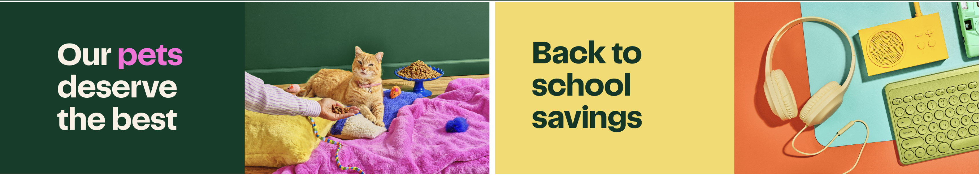
The following images show an example of a single banner carousel with the heading Bite into Tokyo, followed by a split banner carousel with the headings Get a taste of Cancun and Get a taste of Italy. The split banner carousel has an arrow at the end to indicate that there are more banners to view.


Slim banner
A slim banner spans a page but takes up less vertical space (height) than a primary or secondary banner. Use a slim banner to highlight key messages in a compact way. When adding a slim banner, you can add text, a call to action button, and an optional image.
The following image shows an example slim banner:

Image tile carousel
An image tile carousel spans a page and can contain several image tiles and an optional title. Image tiles can be customized with an image and link text. Image tile carousels take up less vertical space than banner carousels and can be used to highlight links to content on your storefront site or to redirect to another site, such as a third-party CMS site.
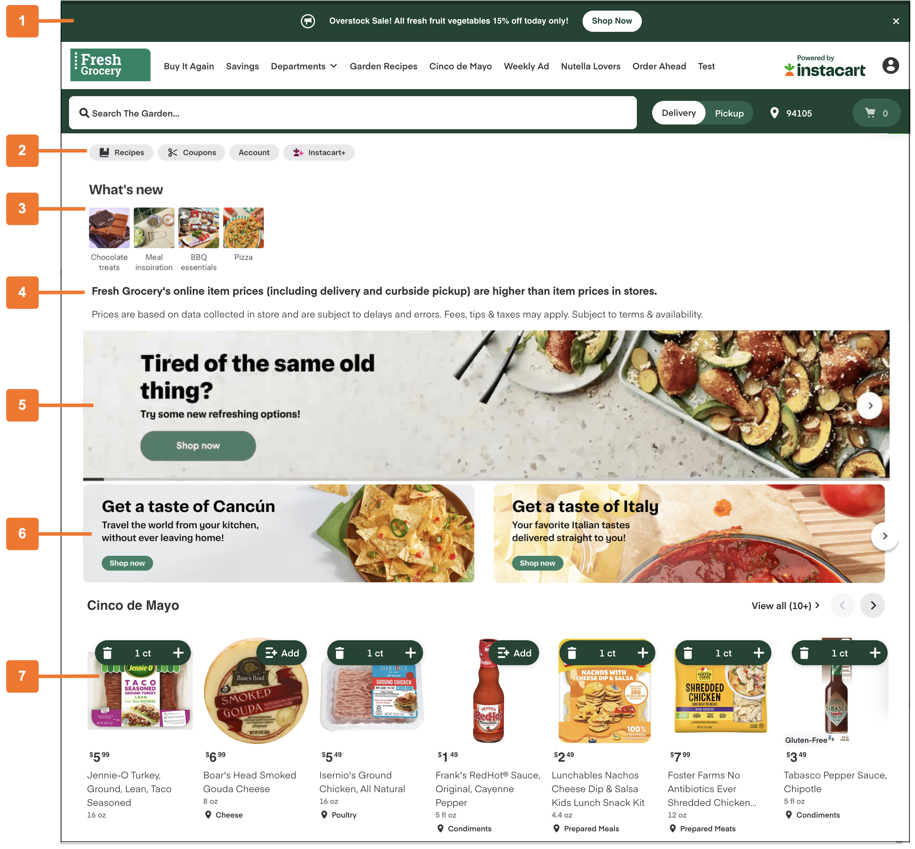
The following image shows an example of a What’s new image tile carousel, with image tiles for Chocolate treats, Meal inspiration, BBQ essentials, and Pizza:

Quick link carousel
A quick link carousel can contain several quick link pills and takes up less vertical space. Quick link pills can contain an icon and a text link, or can be a text only link. Use quick link carousels to highlight links to useful or common destinations for your customers.
The following image shows an example of a quick link carousel with links for Recipes, Coupons, Account, and Instacart+:

Content card carousel
Content cards are magazine-style layouts that can include customized images, text, and call-to-action buttons for impactful storytelling. Horizontal cards can include a portrait-oriented photo on the right, with text and an optional button on the left. Vertical cards can include a landscape-oriented photo across the top, with text and an optional button on the bottom. You can create card carousels with a title, and up to five vertical cards or up to three horizontal cards. You can choose the text, background, and button colors, input text, and upload images for the card content.
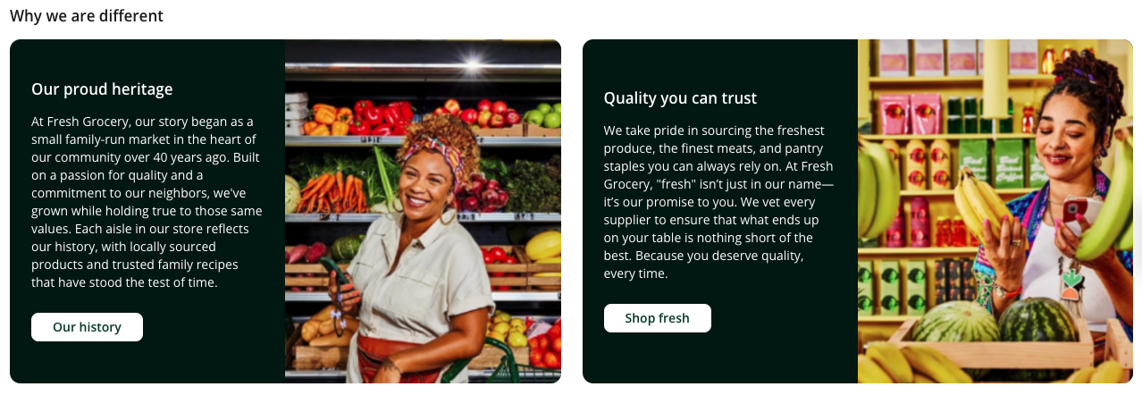
The following image shows an example of a horizontal cards carousel:
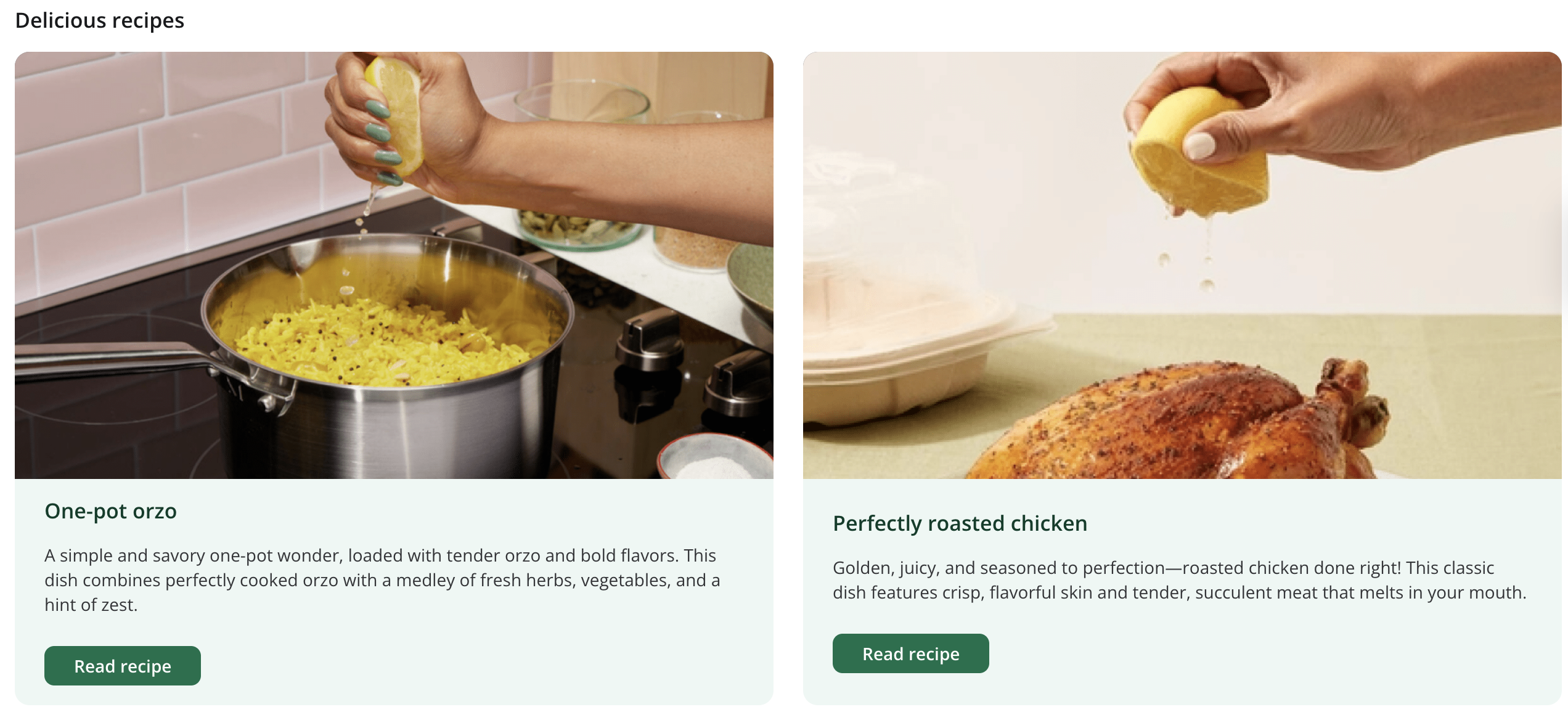
The following image shows an example of a vertical cards carousel:
Product carousel
A product carousel displays products. Add product carousels to help customers easily find and add items to their cart.
You can add the following types of product carousels:
-
Standard Product Carousel. Displays the products in a collection. Customers can click the arrows to browse the products or click a button to go to the collections page, which displays the entire collection in a product grid.
-
Sponsored Products Ads Carousel. Displays sponsored products only. The products are chosen by the Carrot Ads service’s algorithm. Customers can click the arrows to browse the products.
The following image shows an example of a Sponsored Products Ads carousel:

-
Flyer Product Carousel. Displays flyer items based on your flyer data files. Customers can also click a call-to-action link, which opens the flyer.
-
Featured Collection Carousel. Displays the products in a collection similar to the standard product carousel, with added support for a custom title, subtitle, and a cover tile. The cover tile can feature an image, animated looped image, or video to capture your customer’s attention.
The following image shows an example of a In store favorites featured collection carousel, followed by a Snacks standard product carousel:

Text container
A text container displays a block of text with an optional title. You can style the text by adding typographical emphasis, changing text colors, adding links, formatting with lists, and changing alignment. Use rich text containers to create additional content to support your business needs. For example, use text containers to explain your mission statement or privacy policy.
Section text
Section texts let you organize long content like Frequently Asked Questions (FAQ) or About Us pages. You can add section text creatives to content pages only.
You can add the following types of section texts:
-
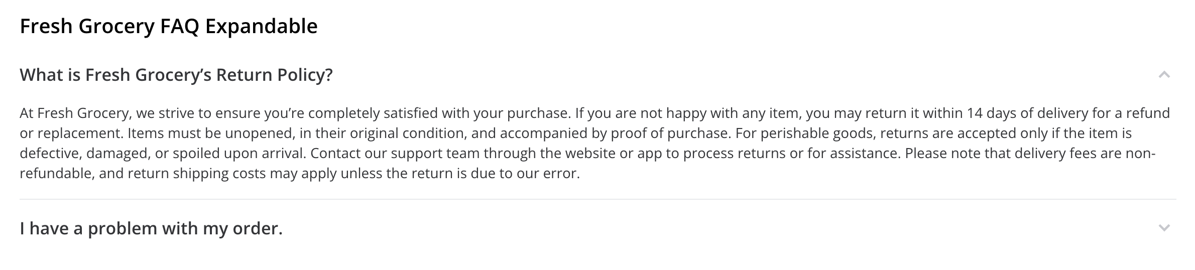
Expandable sections. Customers see the title of the section and can click to expand the section and read the body text.
The following image shows an example of an FAQ content page with an expandable section text creative with one of the questions expanded:
-
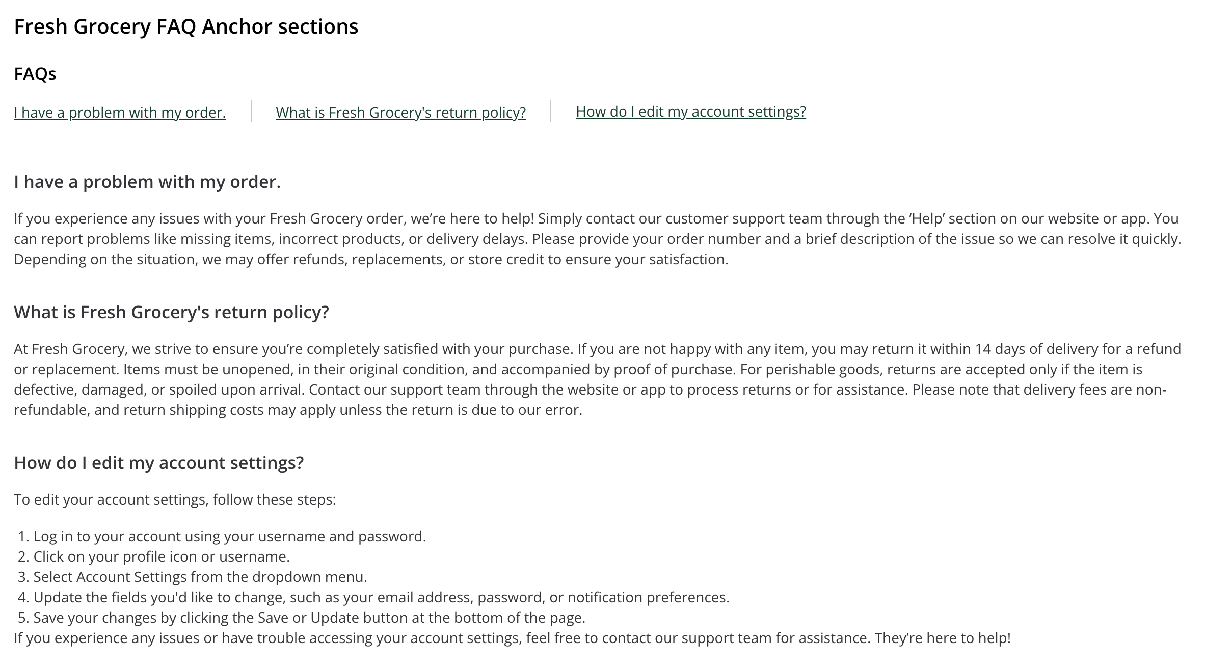
Anchor sections. Customers can click a section link and be taken directly to the section they want to read.
The following image shows an example of an FAQ content page with an anchor section text creative:
Recipe carousels
Recipe carousels display recipes or categories of recipes. Add recipe carousels to help customers streamline their meal planning and grocery shopping.
You can add the following types of recipe carousels:
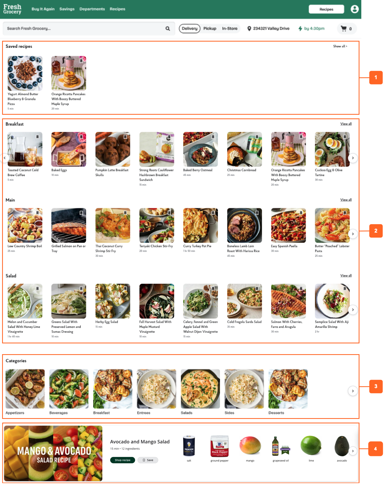
- Saved recipes carousel. Displays the recipes that the customer saved.
- Recipes carousel. Displays the recipes in a category. For example, the Breakfast recipe carousel might include recipes for breakfast wraps, cold brew iced coffees, and pancakes.
- Recipe categories carousel. Displays the recipe categories. For example, Appetizers, Breakfast, and Entrees.
- Recipe collection carousel. Displays a cover tile and the products needed to make the recipe.
Configuration
To configure slots and creatives, use Instacart Platform Portal.
-
To create and manage creatives in your storefront, use the Marketing > Creatives manager. For more information, see Creatives.
-
To add slots and creatives to different areas of your storefront, do the following:
-
Add a slot to a page.
- To add a slot to a content page, see Manage content pages.
- To add a slot to the homepage, see Manage custom homepage.
-
Add content to the slot.
- For static slots, you can add existing creatives or design a new creative.
- For dynamic slots, you can add Drive awareness campaigns.
-