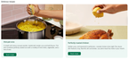
Content card carousel
Content cards are magazine-style layouts that can include customized images, text, and call-to-action buttons for impactful storytelling. Horizontal cards can include a portrait-oriented photo on the right or left, with text and an optional button on the opposite side. Vertical cards can include a landscape-oriented photo across the top or bottom, with text and an optional button on the opposite side.
You can create card carousels with a title, and up to five vertical cards or up to three horizontal cards. You can choose the text, background, and button colors, input text, and upload images for the card content. When configuring a content card carousel on a content page or custom homepage, you can adjust its visual style. You can align the text within each card and choose colors for card backgrounds, text, and buttons.
The following image shows an example of a horizontal cards carousel:
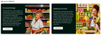
The following image shows an example of a vertical cards carousel: